The Brief:
Backbone Brewing Co. needed a brand identity that lives up to its name, conveying trust, confidence, ability, and tradition. The challenge was to create a visual system for their bar and brewing company that feels established and dependable.
Solution:
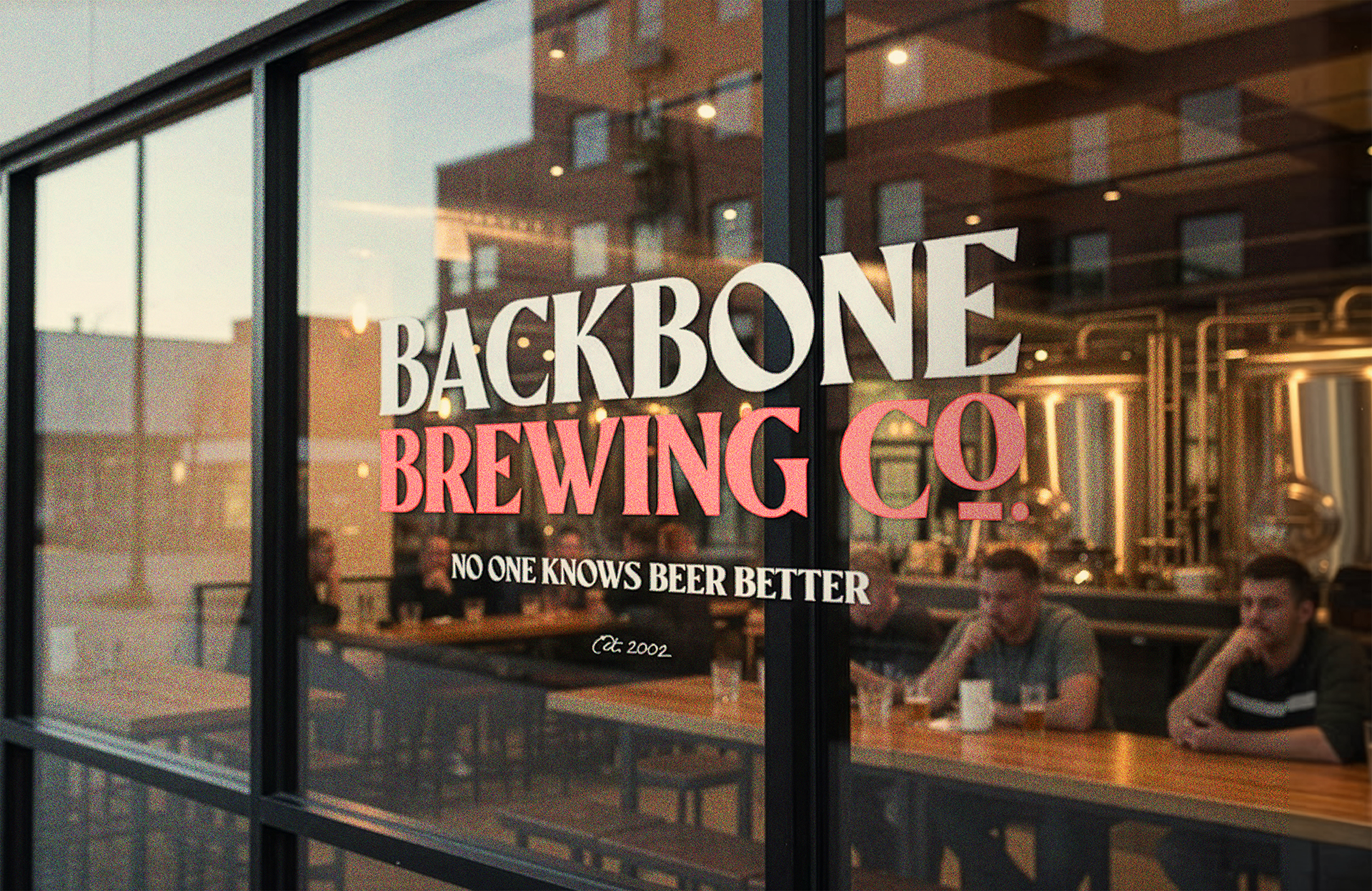
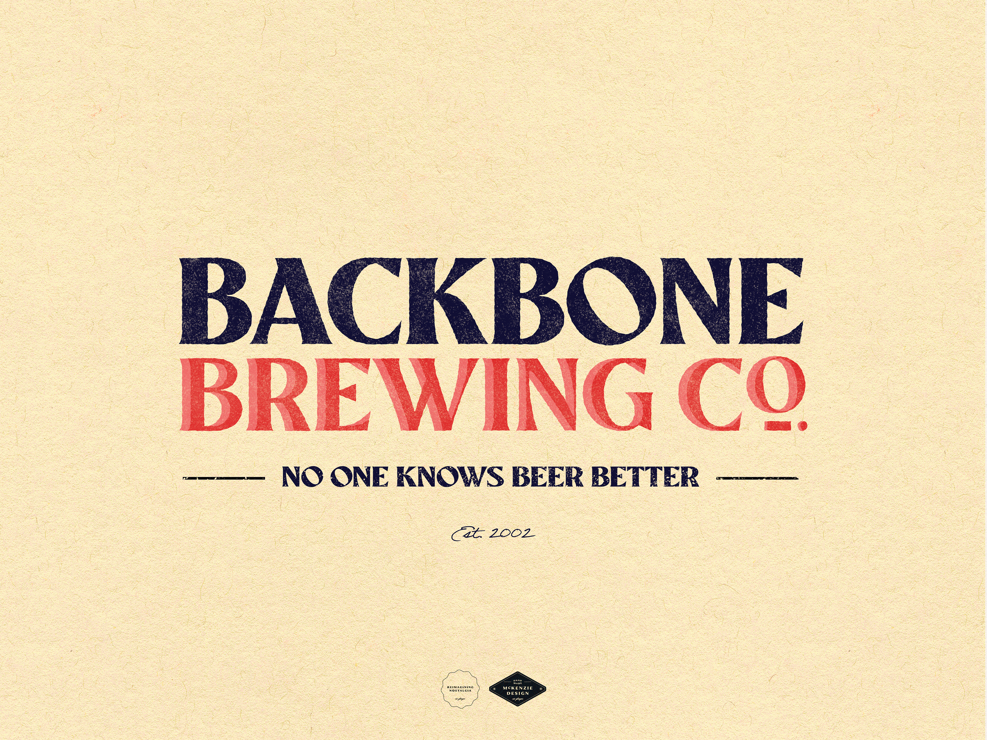
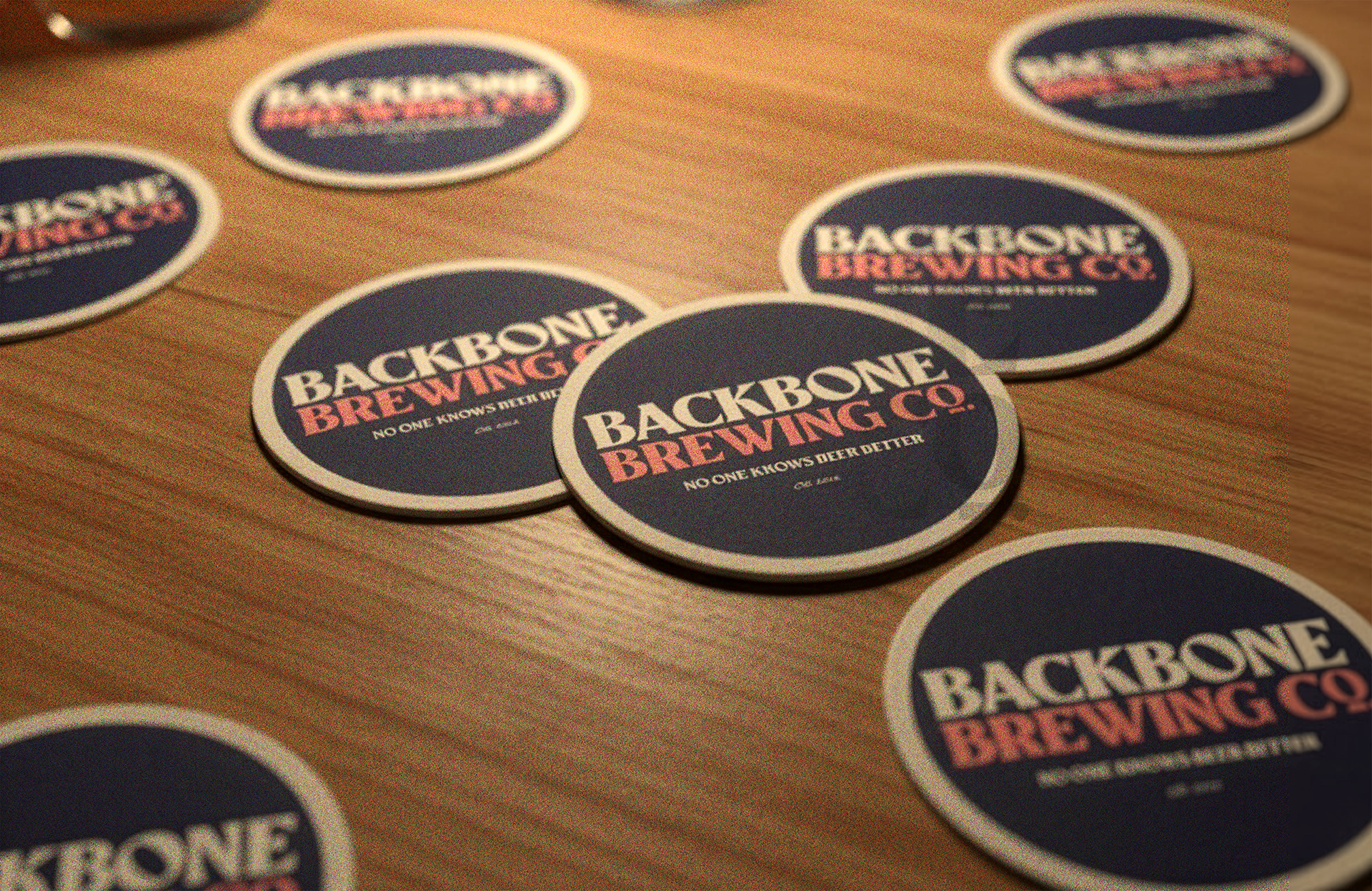
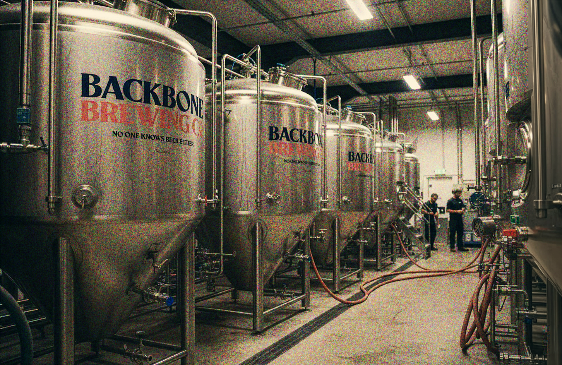
I developed a traditional brand identity built on a simple colour system: blue for dependability and pink for personality, using white in place of blue when appropriate. The balance between these colours mirrors the brand itself; serious about craft, but never taking itself too seriously.
The typography does the heavy lifting. Slanted Os throughout the wordmark add a distinctive playfulness. Serif letterforms and the underlined "o" in "Co." anchor the brand in brewing tradition. Strong character width across the typeface reinforces confidence and presence - 'This is a brewery with backbone.'